Choosing the right one. What a problem.
I mean - if you look at them, with their different personalities and sexy curves,
how can you prefer one over another? Maybe you like long legs, or are fascinated
by bold shapes - but then you see that elegant thin one and you just cant’ help falling in love...
Now, maybe it’s a question of age. Young, I was fascinated by Californian types:
quirky, exotic in a contemporary way, the ones to spend the night having fun with.
But then, growing up, I started to find them a bit too childish,
and cute in a cheap way: and realized the class of something more modern would suit me better.
The Helvetica allure: elegant, timeless, the perfect companion...
Only to fall prey once again, to the fashionable types - well dressed and damn sexy, the ones that can make your head spin...
In the end, can you choose one, without feeling a bit like Don Giovanni in the Mozart Opera,
who admits that whoever is faithful to one is cruel to the others?
This is why we spend hours in front of the font picker in our design software.
Feeling such ample sentiment, we love all of them - but since normal people can’t comprehend these things,
they call our natural goodness typography.
Until we finally meet the right one - the one we tie the knot with.
The right one, the one we will be with together forever and ever. Maybe.
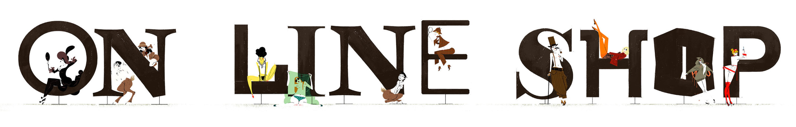
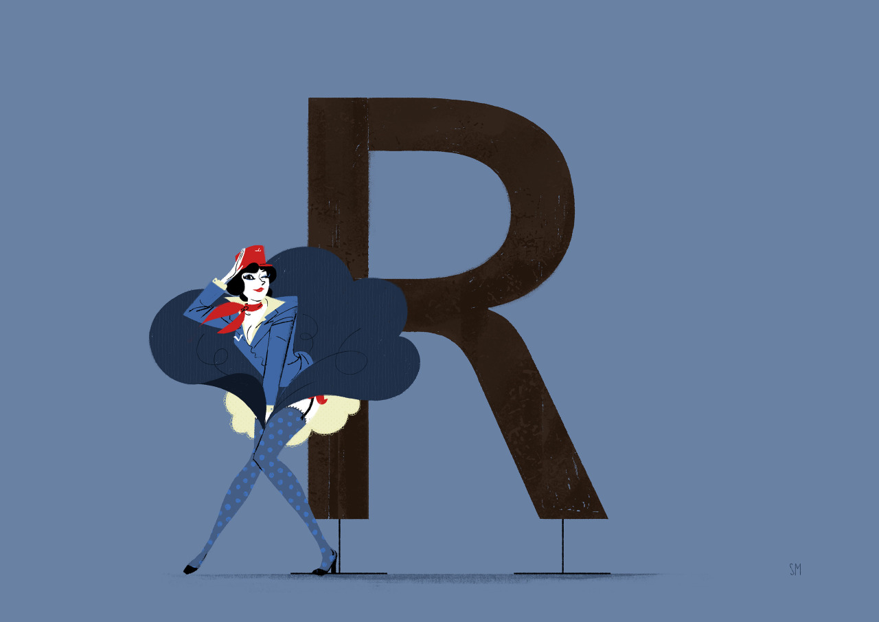
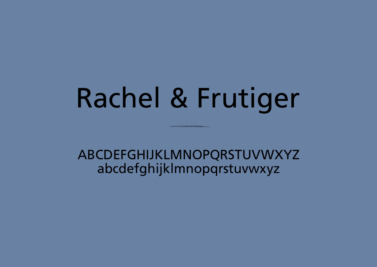
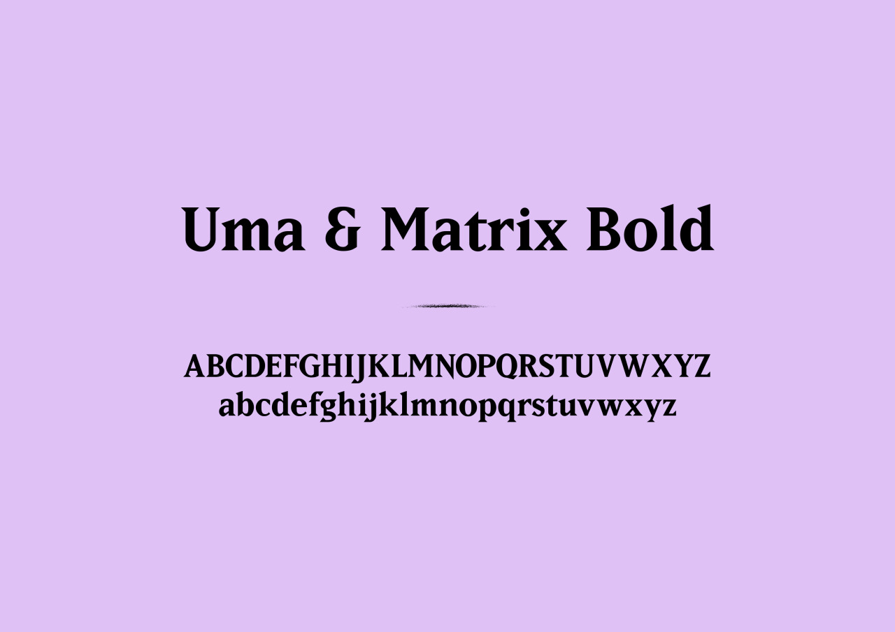
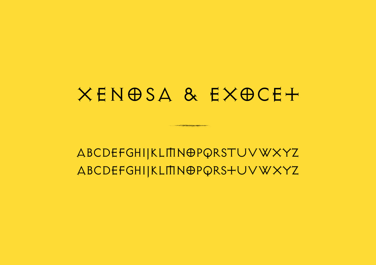
This is an intimate love story between the two things I'm most passionate about: illustration & typography.
If you look closely, this ongoing series of artwork shows more than meets the eye.
The pin-up girls are not just designed to exude all the typefaces' qualities, they also tell a story, which goes beyond the simple pairing of colors and a shapes.
I had many in-depth chats with the designers who created and drew the characters' font families in order to give a soul to these graceful ladies posing with their typographic soul-mates.